Home Screen: Difference between revisions
No edit summary |
No edit summary |
||
| Line 4: | Line 4: | ||
1. An activity graph | 1. An activity graph | ||
2. Opportunity pipeline | 2. Opportunity pipeline | ||
3. Cases pipeline | 3. Cases pipeline | ||
Revision as of 10:33, 21 October 2022
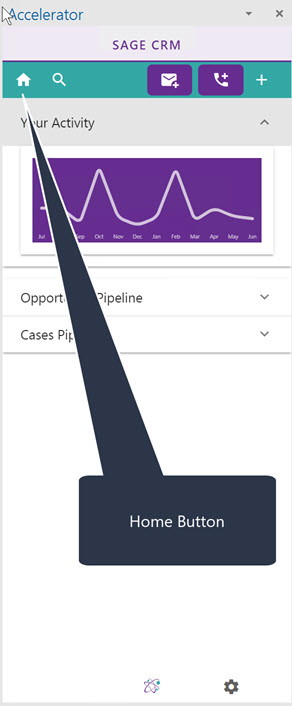
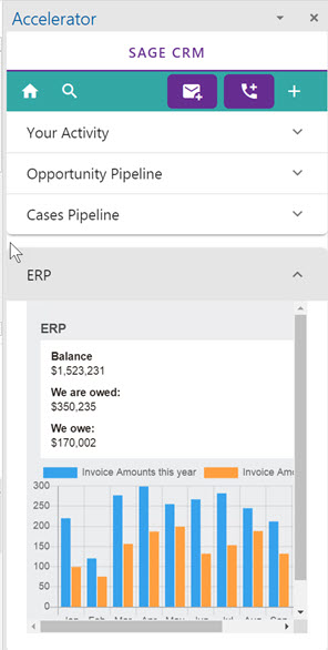
Clicking the Home icon will bring you to the dashboard screen.
This by default contains
1. An activity graph
2. Opportunity pipeline
3. Cases pipeline
Click on the tab to open it. Only one tab at a time can be open.
- Activity graph
This is a graph showing your activity in CRM for the last 365 days. This uses communications created, opportunities, and cases created by the user.
- Opportunity pipeline
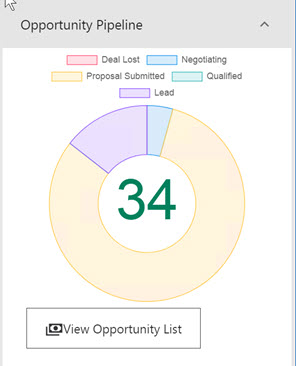
This matches the pipeline that you have in CRM itself. You are presented with a graph and you click the button to view the list of opportunities
- Cases pipeline
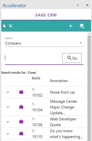
This matches the pipeline that you have in CRM itself. You are presented with a graph and you click the button to view the list of cases
- Customising
You can add a custom page to the dashboard so that it has its own tab.
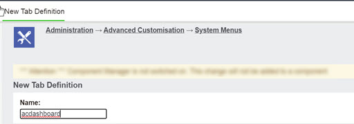
To do this create a new menu in
Administration->Advanced Customisation->System Menus
called
"acdashboard"
Edit this to add in a menu item. For example
 Caption: ERP
 Action: Customfile
 Custom File: sagecrmws/ac2020/sage300overview.asp*
- This is a sample file only
Then restart Outlook or reload the screen. Click Home and you will see the tab.
Technically the url is structured as
https://crm.yourserver.com/CRM/CustomPages/sagecrmws/ac2020/sage300overview.asp?SID=584334583611&F=&J=sagecrmws%2Fac2020%2Fsage300overview.asp&app=ac2020
