Summary Screens: Difference between revisions
(Created page with "Summary screens show a top area with an icon and some data. At a glance a user will be able to see the state of an entity. Company and person summary for example show the ti...") |
No edit summary |
||
| Line 34: | Line 34: | ||
Images usually natigate within the taskpane. The exception is the "External" link icon which can be seen in the section header. | Images usually natigate within the taskpane. The exception is the "External" link icon which can be seen in the section header. | ||
Revision as of 15:05, 14 June 2021
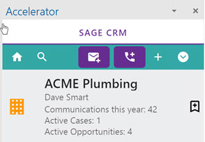
Summary screens show a top area with an icon and some data.
At a glance a user will be able to see the state of an entity.
Company and person summary for example show the title plus the commuications count in the last year and the open opportunities and cases.
The entity icon is on the left of the screen.
The information is in the center and on the right of the screen we have the option to toggle the bookmark.
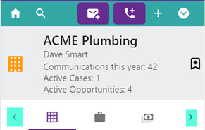
Below this area we have the tabs.
Hover your mouse over the icon to see the caption. If the tabs are too many you will see the <> icons to navigate across.
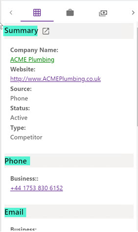
Screens are made up of sections. Section fields are usually controlled from CRM via the
ENTITYofficeint
screen. If using a custom entity you will have to create this screen. The exception is the Phone, Email and Address screens.
Links
Text links (usually in green) will open full CRM in a new tab.
Images usually natigate within the taskpane. The exception is the "External" link icon which can be seen in the section header.


